Quantitative Results
Use this report to analyze results of your test for all quantitative properties. Select e.g. an Item to get all properties tested. You can further narrow down specific properties or get an overview about all of them.
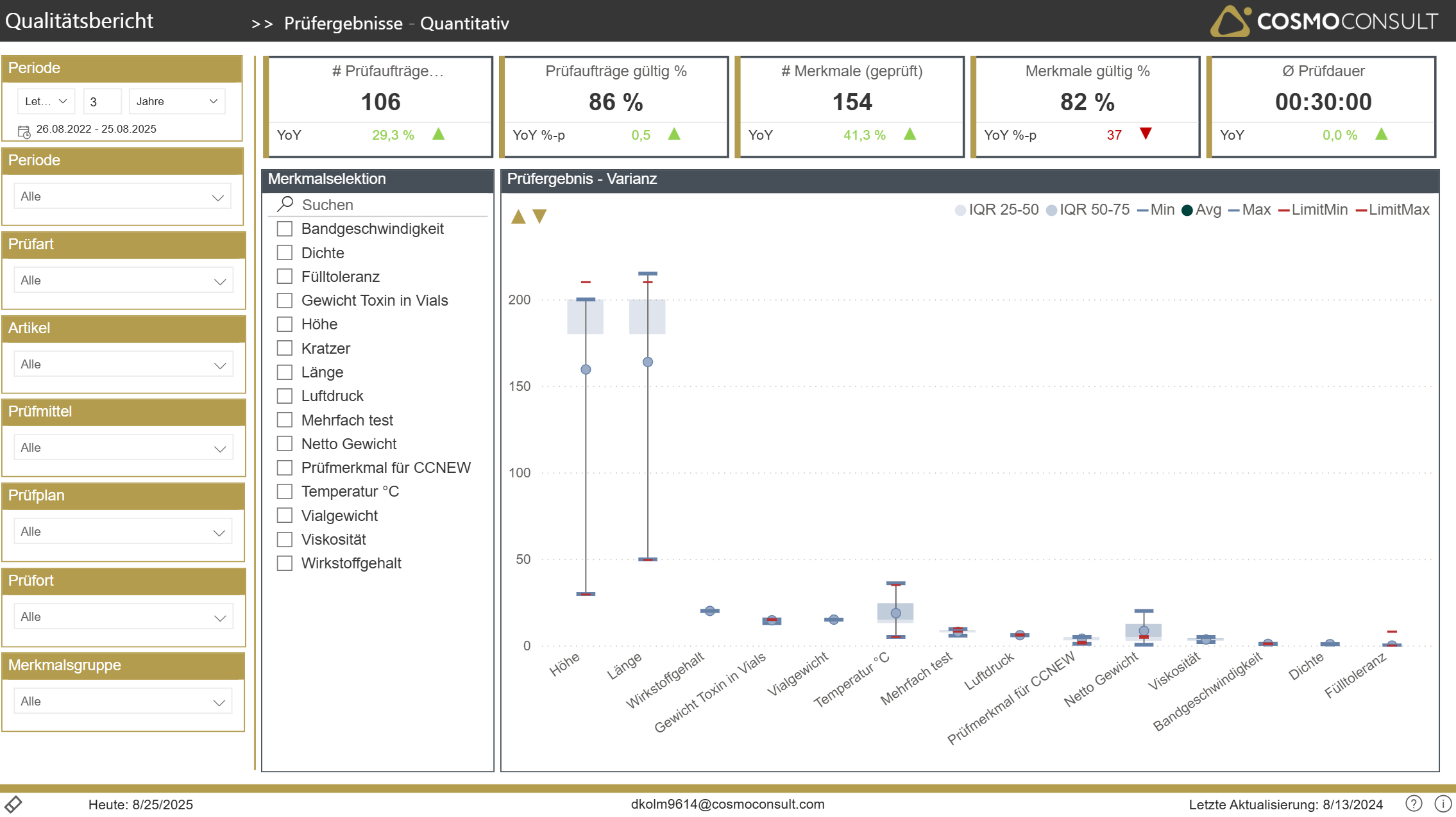
By using the golden-arrows in the upper-left section of the box-plot chart you can adjust the scaling of the Y-axis to see enough details if not by default.
The box-plot chart delivers following values:
Blue Marker: Actual Results
- Min: Minimum value by property within selected period
- Max: Maximum value
- Avg: Average result
Red Marker: Limits
- Min & Max: according to property limits to pass a test
"Whisker": IQR = Inter Quartile Range
- IQR 0-25: area of the lowest 25% of test-results (white area at the bottom)
- IQR 25-50: area of the "next-higher" 25% of test-results
- IQR 50-75: area of the "next-higher" 25% of test-results
- IQR 75-100: area of the highest 25% of test-results (white area at the top)
- The Median is exactly on the upper line of the IQR 25-50 whisker