Sales Report – Overview
The Overview page is the central cockpit for monitoring overall sales performance based on D365 Business Central data.
Overview
This page helps you:
- Track the most important sales KPIs (orders, invoices, profit, new customers) in one place
- Compare actual performance against the previous year (and optionally against plan)
- Understand how sales develop over time at a monthly level
- Identify customers and product groups that drive growth or decline
Filters
Standard slicers on the left allow you to narrow the analysis to specific business segments:
- Client Selection – focus on a single company or compare entities in multi‑tenant scenarios.
- Period Selection – analyze a rolling time frame (e.g. last 2 years) or zoom into specific months.
- Additional Period Filter – select multiple periods (e.g. several months or years) to compare side by side.
- Employee – evaluate sales results for individual salespersons or teams.
- Items – restrict all KPIs and visuals to selected products or product groups.
- Order Customer – focus on specific customers or customer segments.
Using these filters consistently ensures that all KPIs, trends and breakdowns reflect the exact scope you want to analyse (e.g. sales of a specific salesperson for a defined customer portfolio in the last fiscal year).
Key Visualizations
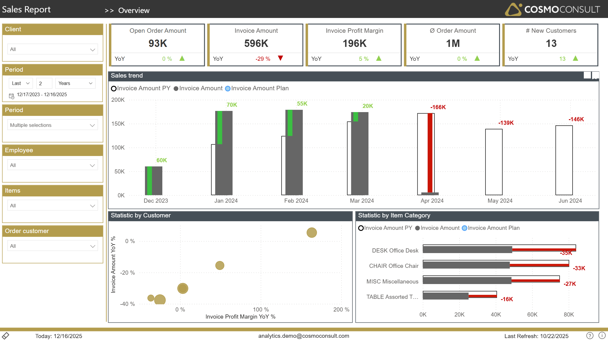
Top KPI Tiles
Gain a quick, management‑level view of sales performance:
- Open Order Amount shows the current order backlog, supporting capacity and revenue forecasting.
- Invoice Amount reveals realized revenue in the selected period.
- Invoice Profit Margin highlights the absolute profit contribution.
- Ø Order Amount helps assess typical deal size.
- # New Customers measures customer acquisition dynamics. Each KPI is complemented by a YoY indicator, allowing instant assessment of improvement or deterioration compared to last year.
Sales Trend vs. Plan and Previous Year
A monthly trend chart compares:
- Actual invoiced sales
- Previous year’s sales
- Planned (invoice/sales) amounts (custom integration required)
This view supports:
- Identifying seasonal patterns and structural trends
- Detecting months with under‑ or over‑performance vs. plan
- Evaluating the effectiveness of sales initiatives over time
Customer Performance Bubble Chart
A scatter plot positions customers by sales growth and margin development. This enables you to:
- Spot high‑potential customers with increasing revenue and margins
- Detect risk customers with declining sales and profitability
- Prioritize account management actions based on factual performance
Item Category Performance
A bar chart contrasts invoice amounts and plan values per item category and highlights variances. This helps you:
- See which product groups over‑ or underperform vs. expectations
- Identify categories where pricing or portfolio actions may be required
- Steer marketing or sales campaigns towards the most promising categories
Typical Use Cases
- Management Sales Review – use the page in recurring steering meetings to review overall sales health, trends, and plan fulfillment.
- Early Warning for Downturns – quickly detect negative YoY deviations at total, customer, or category level and initiate countermeasures.
- Campaign Evaluation – compare periods before and after marketing or pricing campaigns to see their impact on revenue and profit.
- Budget & Forecast Monitoring – contrast actual sales against planned values to monitor budget adherence and adjust forecasts.