Navigation
As a graphical interface that shows shift scheduling information (calendar entries, calendar absence entries, and extraordinary calendar capacity entries), the Graphical Shift Scheduling page allows you to quickly change to different dates and time periods, search for specific entries, change the appearance of the page, and view shift scheduling information using a Gantt chart.
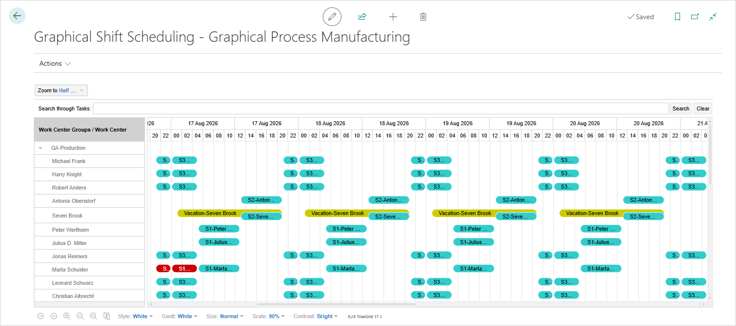
This section provides an overview of how to navigate this page and use the available controls.
Actions Menu
The actions available in the Actions menu allow you to perform various operations related to the schedule, such as navigating to a specific date or updating the calendar data.
Go to Date
The Go to Date field allows you to move to and center the chart on a specific date.
Update Calendar
The Update Calendar action allows you to refresh the schedule with the latest calendar data for the selected date range. This ensures that any changes to work center calendars, absences, or extraordinary capacity entries are reflected in the chart.
Zoom to ...
Just below the Go to Date field is the Zoom to ... drop-down, which allows you to change the view to different time periods. The options are Year, Quarter, Month, Week, Day, Half Day, Hour, Half Hour, and Minute.
Search through Tasks
Next you can search through work center groups, work centers, and shift scheduling entries. This is a free text field so you can enter full or partial values and then press Enter or select Search to find matching resources or tasks. Clear the filter by selecting Clear.
Chart Layout
The left pane shows work center groups and work centers. The right pane shows the graphical timeline with the related calendar entries, calendar absence entries, and extraordinary calendar capacity entries.
For information about working with data loading and refresh behavior in the Graphical Shift Scheduling page, see Usage.
Context Menus
On both sides of the chart, context menus provide related actions and details for the selected work center or schedule entry. Select and hold (or right-click) an object to open its context menu.
For work centers:
- The Work Center Card menu item opens the related work center card.
- The Capacity Ledger Entries, Comments, Load, and Statistics menu items open the relevant pages for the selected work center.
- The Machine menu item opens the related machine card.
- The Capacity Absence and Extraordinary Capacity menu items provide quick access to add new absences and extraordinary capacities without leaving the chart.
- The Capacity Absence menu item opens the Capacity Absence page filtered to the selected work center.
- The Extraordinary Capacity menu item opens the Extraordinary Capacity page filtered to the selected work center.
For calendar entries:
- The Delete menu item deletes the selected calendar entry.
- The Shift Schedule Overview menu item opens the Res. Shift Schedule Overview page filtered to the selected work center.
For calendar absence entries:
- The Capacity Absence menu item opens the Capacity Absence page filtered to the selected work center.
- The Delete menu item removes the selected absence entry.
- The Shift Schedule Overview menu item opens the Res. Shift Schedule Overview page filtered to the selected work center.
For extraordinary calendar capacity entries:
- The Extraordinary Capacity menu item opens the Extraordinary Capacity page filtered to the selected work center.
- The Delete menu item removes the selected extraordinary capacity entry.
- The Shift Schedule Overview menu item opens the Res. Shift Schedule Overview page filtered to the selected work center.
Tooltips
The left-pane includes tooltips for the work center resources, including details such as the work center number and name, work center group number and name, and whether scheduling is required.
The right-pane includes tooltips for calendar, calendar absence, and extraordinary calendar capacity entries:
- Calendar entry and Extraordinary calendar capacity entry tooltips show the related work center number and name, resource planning group, and start/end date/time.
- Calendar absence entry tooltips show the related work center number and name, absence description, whether the calendar has been updated with this absence entry, and start/end date/time.
To view a tooltip, tap (or hover over) an entry.
Chart Changes
The bottom of the page contains controls that allow you to change the appearance of the chart.
Expand/Collapse all rows
The first two icons allow you to either Expand all rows or Collapse all rows in the left pane of the chart.
Zoom In/Zoom Out/Zoom to fit into page
The next icons allow you to zoom into or out of the time periods in the right pane of the chart and to reset to a month view that fits into the page.
Displays menu to choose visible columns
You can add columns to the chart area to show additional details, such as Work Center Group and Work Center No.
Style
The Style drop-down allows you to change the color of the chart area, including text, as well as the control icons at the bottom of the page.
Note
The custom option works with the TreeGrid CSS defined with EJS TreeGrid 17.1.
Gantt
The Gantt drop-down allows you to change the color of the Gantt area of the chart.
Note
The custom option works with the TreeGrid CSS defined with EJS TreeGrid 17.1.
Size
The Size drop-down allows you to change the size (height) of the rows in the chart area.
Scale
The Scale drop-down allows you to change the size of the chart area.
Contrast
The Contrast drop-down allows you to change the contrast between the foreground and background of the chart area.
Feedback
Submit feedback for this page .